Agora.io · 2022 to 2024 · App Builder
Redesigning App Builder for increasing CSAT and MRR
A no-code product rethink focused on first-app activation, customer confidence, and revenue growth, with ecosystem work kept in service of the core App Builder journey.
Role
Principal Product Designer
Scope
App Builder redesign + ecosystem handoffs
Timeline
2022 to 2024
Outcome
38% conversion lift and 2× MRR
Problem
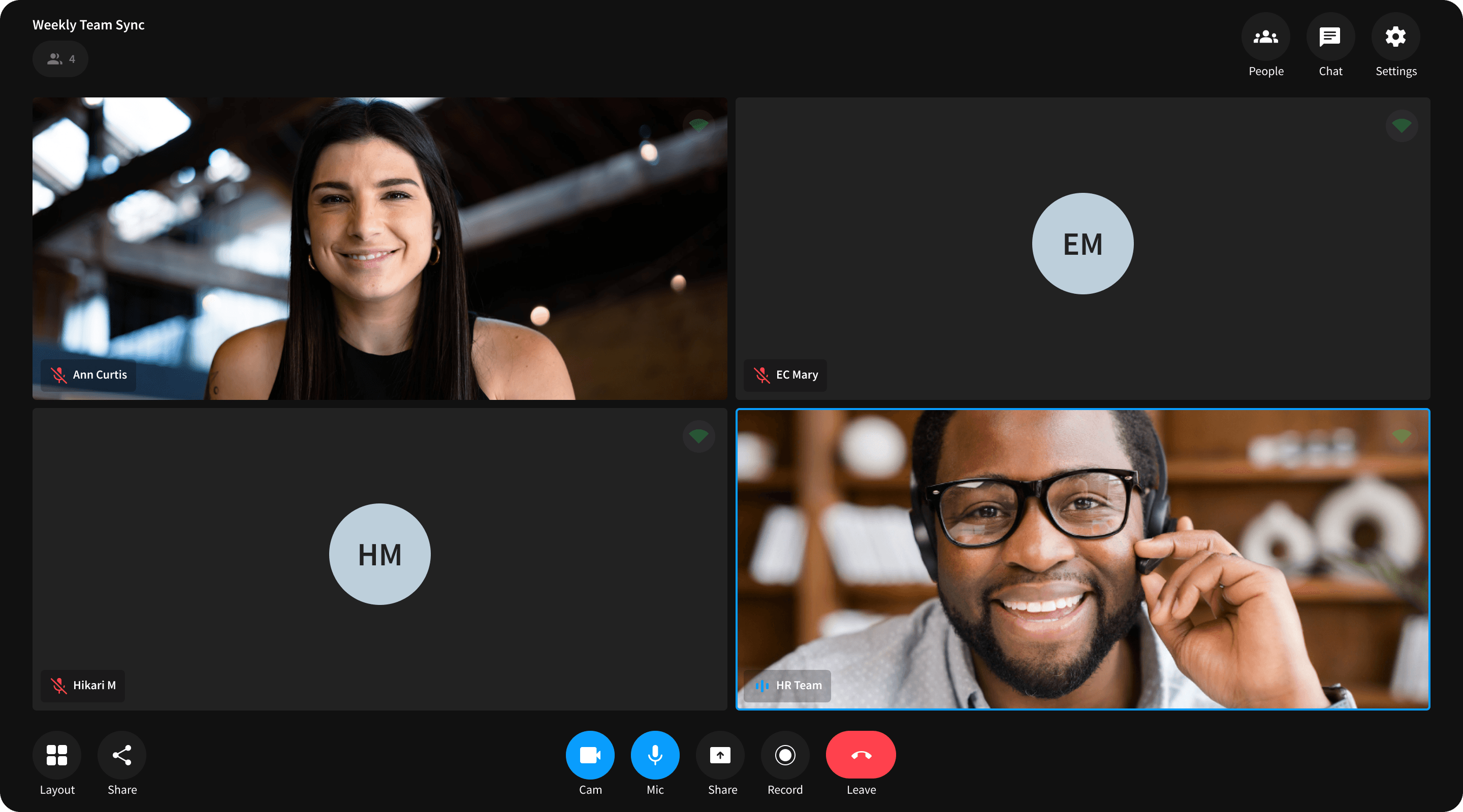
App Builder had product-market interest, but the first session felt like work.
App Builder offered a compelling promise: launch real-time experiences without writing the infrastructure yourself. The challenge was that the first-run journey felt more like software configuration than product creation. People were being asked to make architecture-flavored decisions before they had a clear sense of what a good outcome looked like.
The consequence was commercial, not just experiential. Prospects needed more reassurance, support teams saw the same setup questions repeatedly, and enterprise buyers found enough trust gaps to pause before conversion.
Funnel signal
~50%
Approximate drop from account creation to first app launch, flagged in the draft funnel analysis.
01
Setup asked for commitment before it created momentum.
Users had to choose between formats, flows, and settings before they could see a working shape of the product they were trying to build.
02
Trust was being evaluated long before the product was purchased.
Privacy expectations, accessibility needs, and pricing clarity all shaped whether the product felt safe enough to bring into a real business conversation.
03
Missing finishing features made the product look less ready than it was.
Capabilities like virtual backgrounds, captions, and stronger customization were not fringe asks. They were proof points that the product could handle serious use cases.
Objective
Make the first launch feel guided, credible, and worth paying for.
The redesign objective was not to add more surface area. It was to remove hesitation at the exact moments where people were deciding whether App Builder could take them from a trial experience to a real product.
User goal
Reach a first working app with less ambiguity.
Understand the value of templates, customization, and next steps earlier.
Feel confident about privacy, accessibility, and pricing before committing.
Product goal
Reframe onboarding and core customization so the product feels teachable, not dense. Prioritize clarity at the first launch over exposing every capability up front.
Business goal
Improve conversion and recurring revenue by helping more customers reach a useful outcome, trust the product sooner, and stay engaged beyond the initial test phase.
Research
This was researched like a conversion problem, not just a usability problem.
The draft pointed to a pattern that mattered commercially: people were attracted to the product, but too many of them lost confidence before they reached a first successful outcome. That meant the research needed to connect journey friction to trust, readiness, and buying behavior.
Instead of treating each method as a separate deliverable, I used them as one diagnosis: interviews for evaluation context, funnel analysis for behavioral proof, and usability sessions to see exactly where the interface lost momentum.
Research stack used to separate surface issues from growth blockers
Synthesized from the approved App Builder draft and rewritten around the product diagnosis.
| Method | Participants | Why | What it revealed | Limitation |
|---|---|---|---|---|
| Customer interviews | ~8 existing and prospective customers | Understand how App Builder was being evaluated in real buying and setup contexts. | People were interested in the speed promise, but they lacked confidence in what to do first and what the product would actually output. | Small sample and weighted toward active evaluators. |
| Recent sign-up survey | ~30 recent sign-ups | Check whether the friction was isolated or systemic. | The onboarding experience consistently felt too heavy, and respondents asked for examples, presets, and clearer starting points. | Self-selection bias and limited follow-up depth. |
| First-run usability sessions | 5 first-time users | Watch where momentum dropped in the opening setup flow. | Participants stalled at branch decisions, missed primary actions, and looked for stronger cues about what kind of app they were building. | Short, moderated sessions rather than long-term product use. |
| Funnel review | Aggregate product data | Verify whether the qualitative pain showed up in behavior. | The biggest leak sat between account creation and first launch, confirming that the early product journey was where value was being lost. | Explains where, not why. |
| Competitive teardown | Comparable no-code and real-time products | Benchmark how similar products reduced setup anxiety and signaled maturity. | Competitors framed onboarding, templates, and trust cues more deliberately, making App Builder feel denser than it needed to. | Static product review without customer validation on each competitor. |
People needed a safer first move.
The early journey was not failing because users were careless. It was failing because the product did not stage the first decision well enough.
Examples reduced both learning time and buying anxiety.
Starter patterns helped users imagine the product outcome faster, which also made the product easier to justify internally.
Maturity had to be visible on the screen.
Accessibility, privacy, and pricing were not supporting details. They were part of whether the product looked ready for real teams.
Goals
We prioritized three levers, not one giant redesign.
Case Study 01 is centered on lifecycle behavior and platform adoption. App Builder needed a different frame. Here the job was to improve commercial readiness by making the product easier to enter, easier to trust, and easier to justify staying with.
Priority lever
Reduce setup anxiety
Use clearer starting points, example-led entry, and less premature complexity so users can form confidence before they are asked to configure deeply.
Success sign: higher first-app completion and fewer stalled sessions.
Priority lever
Make trust visible
Treat accessibility, privacy, and pricing as part of the core product experience so enterprise evaluators do not have to infer maturity from documentation alone.
Success sign: fewer trust objections across support, onboarding, and sales conversations.
Priority lever
Strengthen the reason to convert
Close the gap between a good first demo and a product that feels worth paying for by improving perceived readiness, not just adding more surface area.
Success sign: 38% lift in conversion and 2× MRR.
How we evaluated progress
We were looking for a tighter connection between product clarity and business response: fewer abandonment moments, fewer repeated trust questions, and a stronger handoff from first use to paid intent.
That made this section less about a rigid behavior framework and more about identifying which specific product levers were worth betting on.
Outcome measures
First-app completion moved in a positive direction.
Conversion improved by 38% where the redesign was applied.
Monthly recurring revenue doubled over the measured period.
Solution
The redesign focused on teaching faster and earning trust earlier.
The strongest product changes were not abstract framework decisions. They were visible, practical changes that made App Builder easier to start, easier to evaluate, and easier to imagine using in a real business context.
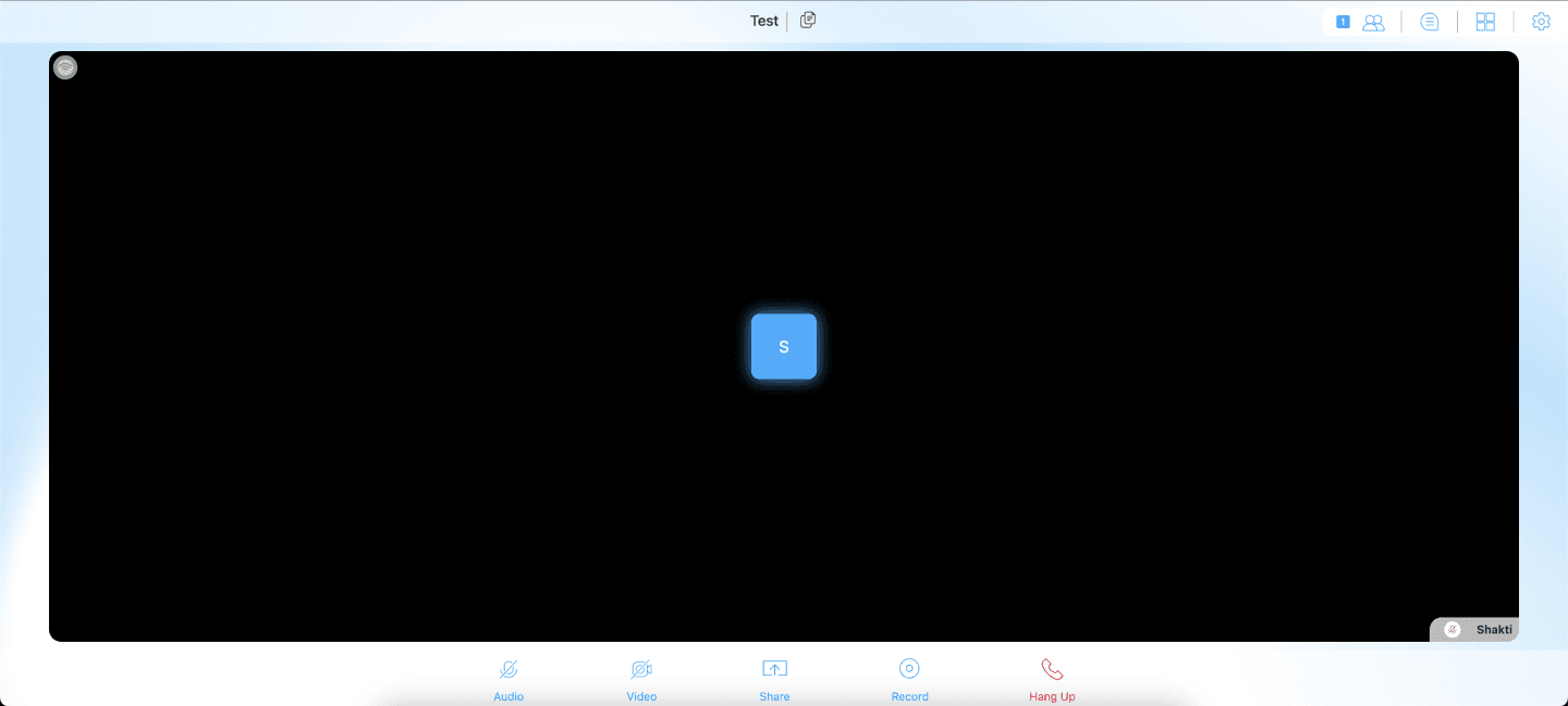
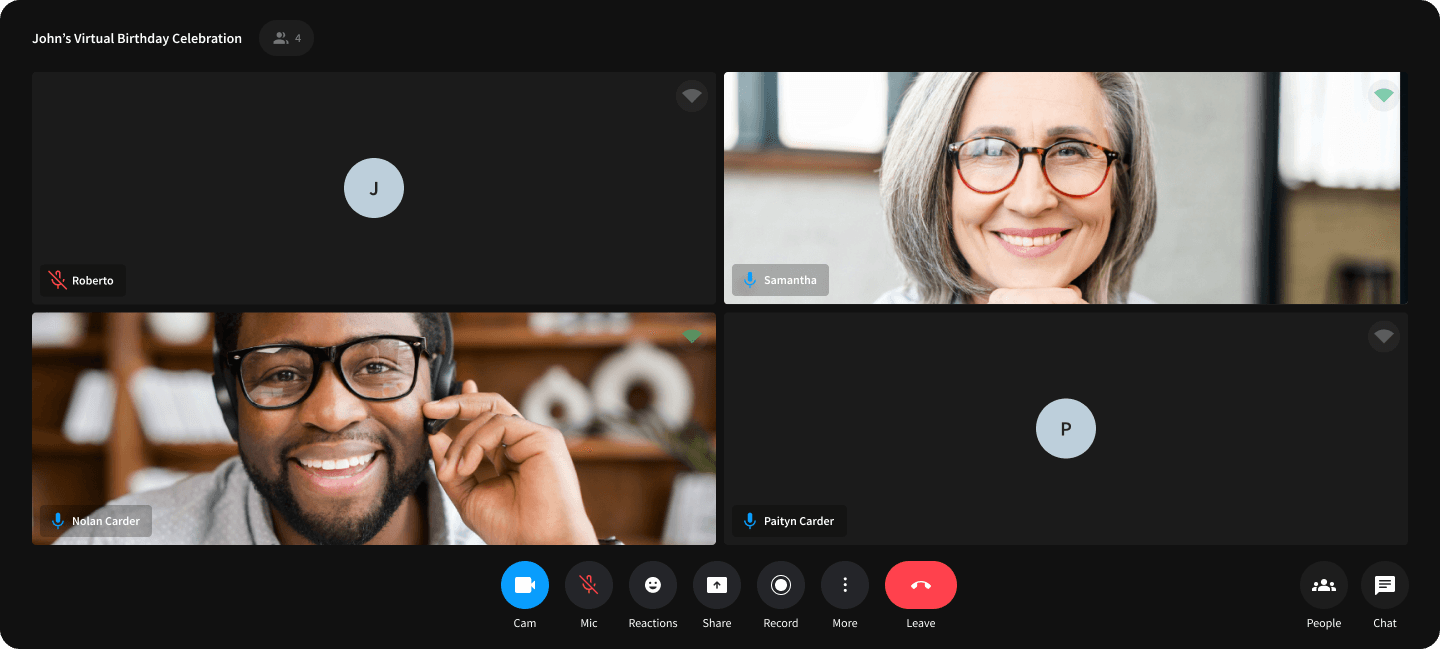
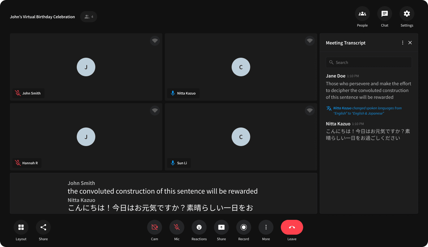
Before and after the redesign
Before
After
Accessibility
Speech to text made the product more usable and more credible.
Live captions addressed a practical accessibility need while also signaling that App Builder was not just for basic demos. It was a concrete step toward enterprise readiness.
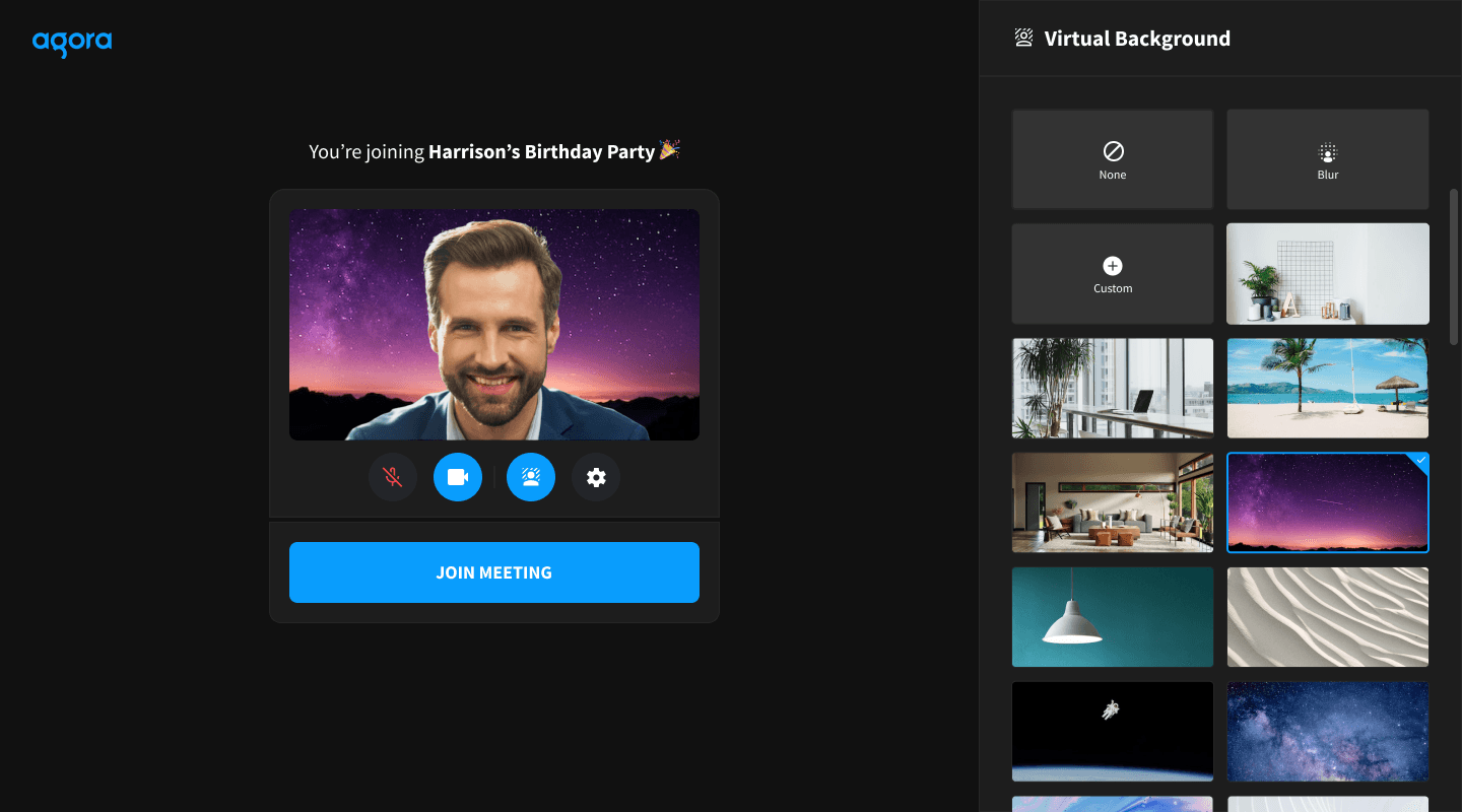
Privacy
Virtual backgrounds removed a common enterprise objection.
This was a small interaction on screen and a large trust signal in practice. Customers evaluating the product for real meetings needed to know they could protect personal space and brand fit.
Too many upfront choices slowed people down.
Restructure onboarding around clearer starting points and progressive disclosure.
Users could see a path to a finished app before being asked to master every setting.
Examples taught faster than explanations.
Lead with more concrete starting states, before/after clarity, and feature framing tied to real use cases.
The product felt more learnable because users were orienting around outcomes, not abstract controls.
Trust blockers were conversion blockers.
Prioritize privacy, accessibility, and customization features that made the product feel enterprise-ready.
The redesign improved fit for real customer evaluation, not just visual polish.
The redesign also changed how the product was discussed internally. A better onboarding path, stronger trust signals, and clearer feature framing made App Builder feel like a product customers could adopt, not just an interface on top of infrastructure.
Results
The strongest outcomes came from making the product feel easier to trust.
The clearest business signals from the redesign were the ones already captured in the product story: conversion moved up, recurring revenue doubled, and the product became easier to defend in both customer evaluation and internal prioritization.
38%
Lift in free-to-paid conversion
2×
Monthly recurring revenue
↑
Customer satisfaction moved in the right direction
↓
Onboarding friction reduced directionally
What changed
Customers had a clearer path from first interaction to a working app. The redesign reduced blank-state anxiety, surfaced more persuasive trust cues, and made the product easier to compare favorably in real buying conversations.
What stayed true
The product still needed to sit inside a larger ecosystem to do its best work. App Builder improved on its own, but the full value story became stronger when Console, demos, and adjacent products were designed to hand people into it more intentionally.
Ecosystem
App Builder got stronger when the surrounding products stopped feeling disconnected.
This case study is intentionally App Builder-first. The ecosystem work mattered because it helped the product attract better-qualified users, hand them in more cleanly, and create continuity once they outgrew the no-code path.
In other words: the ecosystem story belongs at the end because its job was to reinforce the App Builder story, not replace it.
Attract
Marketing site
Frames why the product matters.
Evaluate
Demos + Perf Lab
Shows proof before signup.
Onboard
Console
Issues access and routes users in.
Build
App Builder
Gets teams to a real app faster.
Scale
Agent Studio
Takes over when complexity grows.
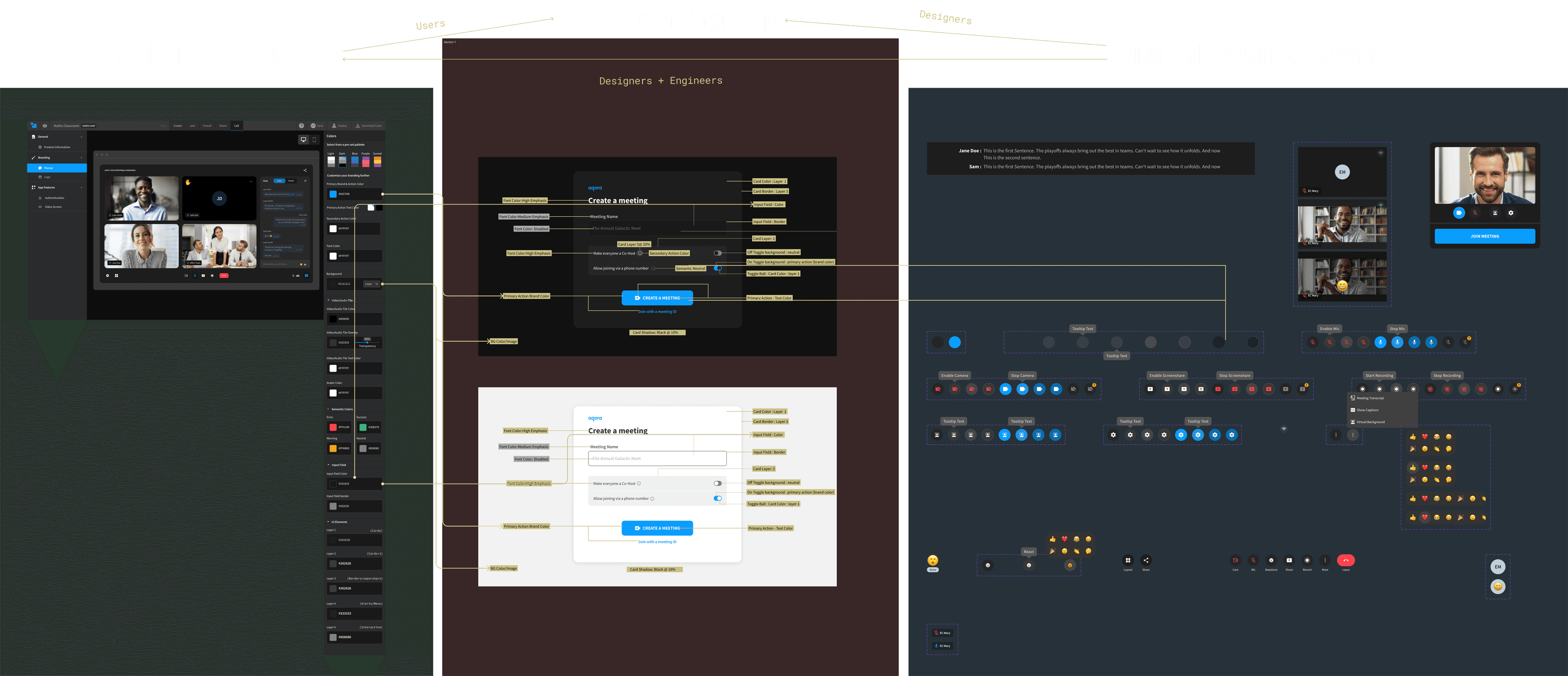
System bridge
Token mapping connected App Builder to the rest of the platform.
Theme and brand settings edited inside Console could flow into the deployed App Builder experience. That made the product feel less isolated and more like part of a coherent platform journey.
Marketing site
Attract and frame the value story before signup.
Creates a clearer handoff into Console and App Builder.
Demos + Performance Lab
Let prospects try the technology and compare performance earlier.
Reduces uncertainty before users commit to building.
Console
Own account setup, keys, and product routing.
Becomes the bridge into App Builder rather than a separate start line.
App Builder
Give users the fastest route to a real-time app without writing code.
Acts as the most accessible entry point into the platform.
Agent Studio
Take over when no-code is no longer enough.
Extends the journey for teams ready for deeper AI orchestration.
For the adjacent AI orchestration story, see Case Study 01.